Our New Look Ahead of Our 40th Anniversary
Earlier this month, Horizons made the historic announcement that we have identified over $100 million in future legacy gifts for the LGBTQ community, surpassing a goal of our unprecedented Now and Forever Campaign. Though this news is absolutely reason to celebrate, our work is far from over. On the heels of this announcement is our 40th anniversary in 2020: not only a celebratory year, but also one where we will outline, through a new strategic plan, what is next for the foundation.
To prepare for what lies ahead, today we are launching a new visual identity and website.
In 1988, Horizons adopted its current name, chosen to symbolize our commitment to the LGBTQ community, no matter what lies beyond the horizon. Today, this commitment holds true, and our name remains both fitting and widely known. At the same time, as we aim to grow the foundation’s visibility in our 40th anniversary and beyond, our visual identity must communicate more about who we are.
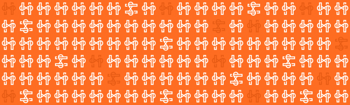
Our infinity H
That’s why our new logo prominently features the infinity symbol. As the crossbar in the letter H for Horizons, the infinity symbol represents our limitless possibilities as a community – that no vision is too bold, no challenge too tough. The infinity symbol also represents forever: that Horizons, through our LGBTQ Community Endowment Fund, will always be there to invest in our community for generations to come.
Our new logo also makes clear the community we serve, with “our LGBTQ foundation” emblazoned at the bottom. As the world’s first community foundation of, by, and for LGBTQ people, Horizons is ours – it belongs to all of us.
This idea underlies our new color palette. To complement new, bolder shades of our existing orange and blue, we’ve added hues of teal, purple, magenta, and yellow. These additional colors each represent one of Horizons’ core audiences: nonprofits, donors, legacy donors, and professional advisors, respectively. Only when all these colors come together, forming our own rainbow, can we achieve our vision of a world where all LGBTQ people live freely and fully.

Putting you at the center
Our new website puts these audiences at the center. With sections “for grant seekers,” “for donors,” and “for advisors,” our new website is designed, first and foremost, to make it easy for you to find the information, tools, and engagement opportunities you seek. The website uses modern, responsive page layouts; concise text and thoughtful visuals; and a number of interactive elements to better communicate who we are and how you can get involved.
We are so thrilled to share our new visual identity and website with you ahead of our 40th anniversary. I encourage you to explore our new website today.